
Charts
Charts are a powerful tool for understanding and interpreting data.
Most charts use aggregations to represent the dataset, and others downsample the data to represent a subset.
Note
See Chart Gallery for all the different charts and their syntax.
First, let’s import the modules needed for this notebook.
# VerticaPy
import verticapy as vp
from verticapy.datasets import load_titanic, load_iris, load_world, load_amazon, load_africa_education
# Numpy & Matplotlib
import numpy as np
import matplotlib.pyplot as plt
Let’s start with pies and histograms. Drawing the pie or histogram of a categorical column in VerticaPy is quite easy.
Note
You can conveniently switch between the three available plotting libraries using set_option().
# Setting the plotting lib
vp.set_option("plotting_lib", "highcharts")
titanic = load_titanic()
titanic["pclass"].bar()
titanic["pclass"].pie()
titanic["home.dest"].bar()
These methods will draw the most occurent categories and merge the others. To change the number of elements, you can use the max_cardinality parameter.
titanic["home.dest"].bar(max_cardinality = 5)
When dealing with numerical data types, the process is different. Vertica needs to discretize the numerical features to draw them. You can choose the bar width (h parameter) or let VerticaPy compute an optimal width using the Freedman-Diaconis rule.
titanic["age"].hist()
titanic["age"].hist(h = 5)
You can also change the occurences by another aggregation with the method and of parameters.
titanic["age"].hist(method = "avg", of = "survived")
VerticaPy uses the same process for other graphics, like 2-dimensional histograms and bar charts.
Let us showcase another plotting library for these plots.
# Setting the plotting lib
vp.set_option("plotting_lib", "plotly")
titanic.bar(["pclass", "survived"])
Note
VerticaPy has three main plotting libraries. Look at Chart Gallery section for all the different plots.
titanic.hist(
["fare", "pclass"],
method = "avg",
of = "survived",
)
Pivot tables give us aggregated information for every category and are more powerful than histograms or bar charts.
titanic.pivot_table(
["pclass", "fare"],
method = "avg",
of = "survived",
fill_none = np.nan,
)
Box plots are useful for understanding statistical dispersion.
titanic.boxplot(columns = ["age", "fare"])
titanic["age"].boxplot()
Scatter and bubble plots are also useful for identifying patterns in your data. Note, however, that these methods don’t use aggregations; VerticaPy downsamples the data before plotting. You can use the max_nb_points to limit the number of points and avoid unnecessary memory usage.
iris = load_iris()
iris.scatter(
["SepalLengthCm", "PetalWidthCm"],
by = "Species",
max_nb_points = 1000,
)
Now, let us look at a 3D scatter plot.
iris.scatter(
["SepalLengthCm", "PetalWidthCm", "SepalWidthCm"],
by = "Species",
max_nb_points = 1000,
)
Similarly, we can plot a bubble plot:
iris.scatter(
["SepalLengthCm", "PetalWidthCm"],
size = "SepalWidthCm",
by = "Species",
max_nb_points = 1000,
)
For more information on scatter look at scatter()
Hexbin plots can be useful for generating heatmaps. These summarize data in a similar way to scatter plots, but compute aggregations to get the final results.
# Setting the plotting lib
vp.set_option("plotting_lib", "matplotlib")
iris.hexbin(
["SepalLengthCm", "SepalWidthCm"],
method = "avg",
of = "PetalWidthCm",
)
Out[6]: <Axes: xlabel='SepalLengthCm', ylabel='SepalWidthCm'>

Hexbin, scatter, and bubble plots also allow you to provide a background image. The dataset used below is available here.
africa = load_africa_education()
# displaying avg students score in Africa
africa.hexbin(
["lon", "lat"],
method = "avg",
of = "zralocp",
img = "img/africa.png",
)

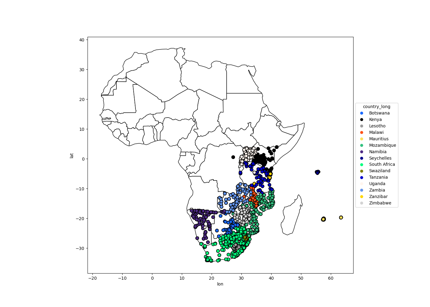
It is also possible to use SHP datasets to draw maps.
# Africa Dataset
africa_world = load_world()
africa_world = africa_world[africa_world["continent"] == "Africa"]
ax = africa_world["geometry"].geo_plot(
color = "white",
edgecolor = "black",
);
# displaying schools in Africa
africa.scatter(
["lon", "lat"],
by = "country_long",
ax = ax,
max_cardinality = 100
)
Out[10]: <Axes: xlabel='lon', ylabel='lat'>
Time-series plots are also available with the plot() method.
amazon = load_amazon();
amazon.filter(amazon["state"]._in(["ACRE", "RIO DE JANEIRO", "PARÁ"]));
amazon["number"].plot(ts = "date", by = "state")
Out[13]: <Axes: xlabel='date', ylabel='number'>
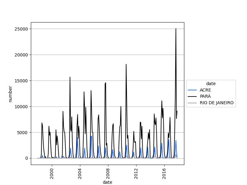
Since time-series plots do not aggregate the data, it’s important to choose the correct start_date and end_date.
amazon["number"].plot(
ts = "date",
by = "state",
start_date = "2010-01-01",
)