Viewing the Overview Page
The Overview page displays a dynamic dashboard view of your database.
The page provides three tabs: Status Summary, System Health, and Query Synopsis. Access these tabs by clicking one of the three icons at the top left of the Overview page. Each tab contains charts and filters displaying information about your cluster. The QuickStats widgets on the right of the page display alerts and statistics about the state of your cluster.
Information on this page updates every two minutes, however you can adjust that value in the MC Settings page on the Monitoring tab. You can postpone updates by deselecting Auto Refresh in the toolbar.
Chart Viewing Options
You can specify time frames for some charts, which display a calendar icon in their title bars. Click the calendar icon to specify the time frame for that module.
On the Status Summary tab, you can select Synchronize charts to simultaneously apply the specified time frame to all charts on that tab.

If you have enabled extended monitoring on your database, MC can display longer ranges of data in certain charts. See Extended Monitoring. If a chart is using extended monitoring data, the rocket ship icon appears in the title bar:

You can expand some charts to view them in larger windows. Click the expand icon in the title bar to do so:

Changing What the Chart Displays
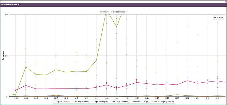
The charts on the Overview page can display information about the nodes in your database, or the activity in all your database subclusters, in a single subcluster, or on the nodes that are not assigned to a subcluster. Use the dropdown in the title bar to select the type of information you want to display in the chart.
The dropdown list in the CPU/Memory/Disk I/O chart below, and all other MC charts, appears only for Eon Mode databases, and only if subclusters (fault groups) are defined.

Zooming to Show Chart Details
There are several steps you can take to show increasing levels of detail in a chart.
You can click the expand icon in the title bar to view the chart in a larger window:

You can use the cursor to outline a small area you want to expand, shown as a gray rectangle below:
When you release the cursor, the detail area expands to full size:
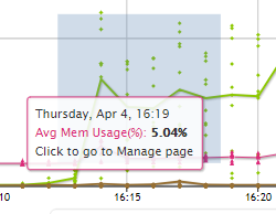
Hover over any line or point on the chart to see details about those specific data points. This works before or after you expand the chart:
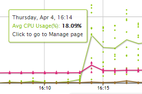
What the Lines and Dots on the Chart Represent
The legend below the CPU/Memory/Disk I/O chart explains what the lines and dots on the chart represent.
Each line represents the average of the nodes you selected in the dropdown. If you selected Database - Nodes, the line represents the average for all the nodes in the database. If you selected one subcluster, the line represents the average for the nodes in that subcluster.
Each dot represents an individual entity within your dropdown choice. If you chose Database - Nodes, each dot represents one node in the database. If you chose Database - Subclusters, each dot represents one subcluster in the database. If you chose a single subcluster or the unassigned subclusters, each dot represents an individual node within that set.
You can hover over any line or dot to see a summary about it. You can click on a dot to display the Node Details page for that dot.
Quick Stats
The Quick Stats sidebar on the right of the page provides instant alerts and information about your cluster's status.
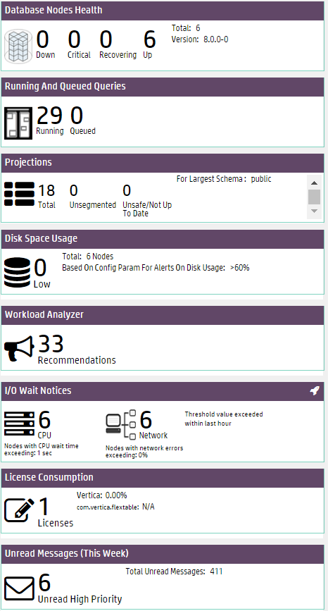
- Database Nodes Health displays which nodes are down, critical, recovering, or up. Critical and recovering nodes are included in the total nodes considered "up" by the database. Click a node value to open the Manage page.
- Running and Queued Queries displays current queries in the database. Click the query values to open the Query Monitoring charts.
- Projections displays the number of total projections, unsegmented projections, and unsafe projections for the database schema with the most projections. Click a value to open the Table Treemap chart.
- Disk Space Usage alerts you to the number of nodes that are low on disk space. Click the value to go to the Manage page. On the Manage page, the Storage Used KPI View is displayed.
- Workload Analyzeranalyzes system information retained in SQL system tables and provides tuning recommendations, along with the cost (low, medium, or high) of running the command. See Analyzing Workloads for more information.
- I/O Wait Notices displays the number of nodes that, in the last hour, have recorded Disk I/O waits and Network I/O waits exceeding the wait threshold (1 second for Disk and 0 seconds for Network).
- License Consumption displays the number of licenses your database uses, and the percentage of your Vertica Community Edition or Premium Edition license being used.
- Unread Messages display the number of unread messages and alerts for the database. This count differs from the number of total messages across all your databases. Click the value to open the Message Center.
Status Summary
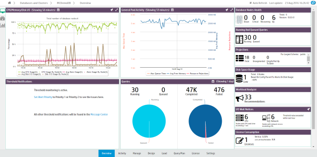
The Status Summary tab displays four modules that provide a general overview of the status of your cluster:
- The CPU/Memory/Disk I/O Usage module shows cluster resource usage. The chart displays the number of nodes in the database cluster and plots average and per-node percentages for CPU, memory, and disk I/O usage.
- Select a resource type from the legend to remove or add it from the chart display.
- Click a data point (which represents a node) to open the Manage page. See Monitoring Cluster CPU/Memory.
- The General Pool Activity module displays GENERAL pool activity. The chart displays average query queue times, average GENERAL pool free memory, and resource rejections. Use this chart to see how much free memory there is in GENERAL pool, or if there have been high queue times.
- Click the dropdown in the title bar to view the GENERAL pool usage for the entire database (the default), for a specific subcluster, or for the nodes not assigned to a subcluster.
- Click the expand icon in the title bar to open the chart in a bigger window.
- Click a data point to open the Resource Pools Monitoring chart. See Managing Workloads.
- The Thresholds Notifications module displays alerts generated when a threshold has been exceeded in the database. Notifications are categorized by System Health and Performance.
- In the module, you can acknowledge an alert (which marks it as read) or click the X to stop monitoring that threshold (which stops you receiving similar alerts in the future).
- Customize thresholds and alert priorities for these notifications in the Thresholds tab of the database Settings page. See Customizing Threshold-Based Notifications.
- The Queries module displays query statistics. The first pie chart displays running and queued queries in the last 24 hours. The second chart displays completed and failed queries for the time frame you specify. Click a query count number above the chart to open the Query Monitoring chart. See Monitoring Running Queries.
System Health
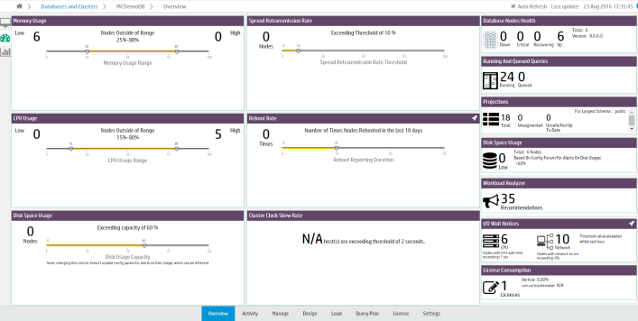
The System Health tab provides a summary of your system resource usage and node information, with filters that allow you to view resource usage within the ranges you specify.
- The Memory Usage filter displays the number of nodes with high and low memory usage. Move the sliders to adjust the memory usage range filter.
For example, if you specify a range of 25% to 75% memory usage, the filter displays how many nodes are using less than 25% of memory (Low) and how many are using more than 75% (High). Hover your cursor over the Low and High values to see lists of what nodes fall, respectively, below or above the memory usage range you specified.
Click a node value to go to the Manage page, which displays the Memory Utilization KPI View. - The Spread Retransmission Rate filter displays the number of nodes with high spread retransmission rates. When a node's retransmission rate is too high, it is not communicating properly with other nodes. Move the slider to adjust the retransmission rate filter.
Hover your cursor over the Nodes value to see a list of what nodes exceeded the spread retransmission rate you specified. Click the node value to view spread retransmit rate alerts in the Message Center. - The CPU Usage chart displays the number of nodes with high and low CPU usage. Move the sliders to adjust the CPU usage range filter. Hover your cursor over the Low and High values to see lists of what nodes are below or above range you specified.
Click a node value to go to the Manage page, which displays the CPU Utilization KPI View. - The Reboot Rate filter displays the number of times nodes in the cluster have rebooted within the specified time frame. Use this filter to discover if nodes have gone down recently, or if there have been an unusual number of reboots. Move the slider to adjust the number of days. Hover over the Times value to see a list of the nodes that have rebooted and the times at which they did so.
- The Disk Space Usage filter displays the number of nodes with high disk space usage. Move the slider to adjust the disk usage filter. Hover your cursor over the Nodes value to see a list of what nodes exceed the acceptable range.
Click the nodes value to go to the Manage page, which displays the Storage Used KPI View. - The Cluster Clock Skew Rate module displays the number of nodes that exceed a clock skew threshold. Nodes in a cluster whose clocks are not in sync can interfere with time-related database functions, the accuracy of database queries, and Management Console's monitoring of cluster activity.
Query Synopsis

The Query Synopsis page provides two modules that report system query activity and resource pool usage:
- The Query Statistics module displays four bar charts that provide an overview of running, queued queries, failed, and completed queries in the past 24 hours.
- Select one of the options at the top of the module to group the queries by Resource Pools, Users, Nodes, or Subclusters.
- Click a bar on the chart to view details about those queries the Query Monitoring activity chart.
- The User Query Type Distribution chart provides an overview of user and system query activity. The chart reports the types of operations that ran. The default is to display the types of operations that ran on all nodes in the database. Use the dropdown in the title bar to display the types of operations that ran on the nodes in a specific subcluster, or on the nodes not assigned to a subcluster.
- Hover your cursor over chart points for more details.
- Select a type of operation from the legend to remove or add it from the chart display.
- To zoom to a certain time frame, you can adjust the sliders at the bottom of the chart.
- Click a bar in the graph to open the Queries chart.