

Overview
Our goal was to demonstrate how Vertica operates at the edge with flight track detail. Vertica ships with a single install rpm file, regardless of platform from on-premises server class hardware, all of the major clouds, or deployments on virtual machines. Vertica installs easily as a single-node or multi-node cluster supporting multi-petabyte databases. Edge analytics pushes data collection out closer to sensor devices to streamline capture and reduce latency of critical analysis. In some remote locations, collecting sensor data and pushing that data up to a data center or cloud is not possible due to bandwidth constraints. Data must be collected locally and the right data transferred to a large central repository for historical archives and analysis. In-database machine learning can be performed on historical data and the analysis pushed down to small edge devices. For our live demonstration of Vertica, a small, low-cost PC serves at the edge analysis database running as a single-node. The Vertica edge PC pictured here is a sub $1,000 small form factor server. The specs include Intel 3.20GHz i5 CPU, 500GB SSD, and 16GB RAM running CentOS 7.
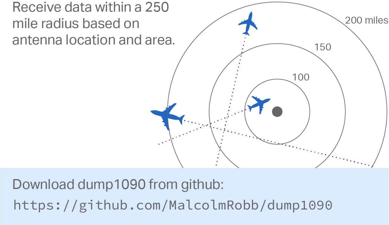
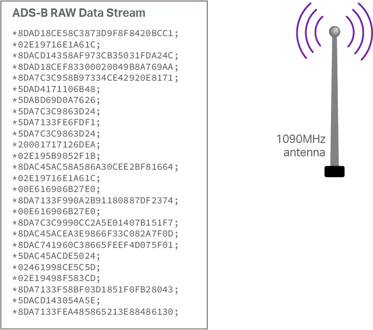 Sensor data is collected using a Raspberry pi with ADS-B radio receiver and full wave-length antenna. As the raw ADS-B data is received, it is decoded into a record format on the Raspberry pi and loaded into Vertica. Record volume can vary based on antenna location indoors or outdoors, time of day, and weather. At peak times, hundreds of aircraft signals can be received representing thousands of records per second. The data loads continually into Vertica with either a direct pipe connection or using a streaming service such as Kafka. Running this set up for several months, the small PC contains billions of flight data points collected within a 250-mile radius of the installed antenna. This easily outgrows the storage and processing capacity of the raspberry pi, but not for Vertica even on low-end hardware. With columnar data compression and minimal tuning, SQL queries and analysis run very fast!
Sample Decoded Data
Preparing the data stream into a format for loading means decoding the raw ASD-B records and expanding into the following format. You’ll see a timestamp when the record was generated and a corresponding timestamp when this record was received, a difference normally in milliseconds. The altitude, latitude, and longitude provide insight on the aircraft location. Airspeed can be easily calculated inside Vertica using the geospatial functions.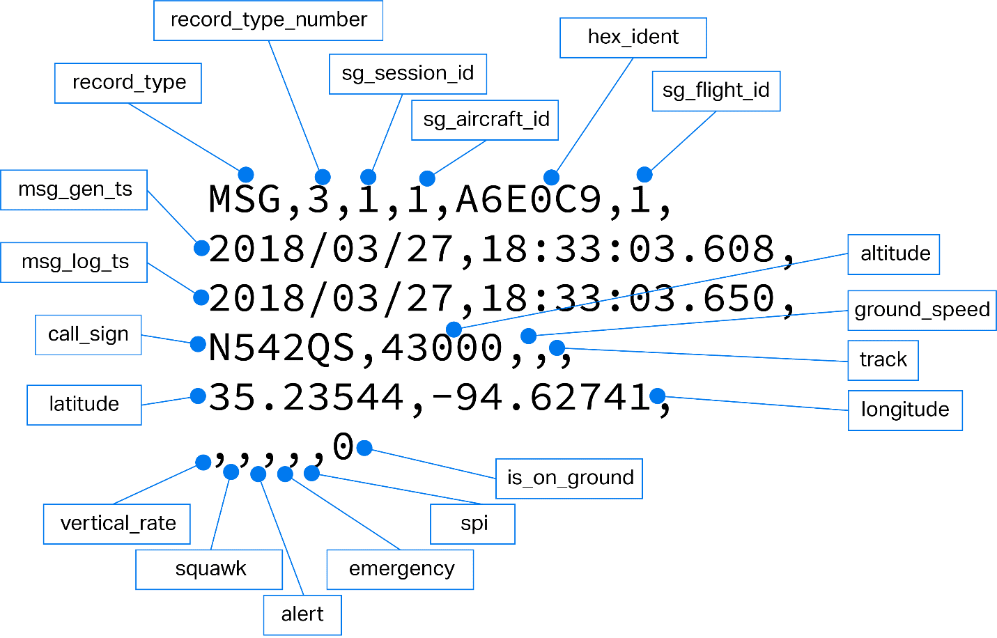 Along with flight data, aircraft registration data is loaded from publicly available data sets. This provides information about the aircraft manufacturer, model, date built, airline or owner name, and much more. Additional data sources might include airport code, weather data, and arrival/departure data all available from public data sources.
Putting it all together
A detailed poster provides an overview of the complete solution starting with data capture, decoding raw data on the Raspberry pi and loading the data into the Vertica database for analysis and visualization using Tableau and Google Earth.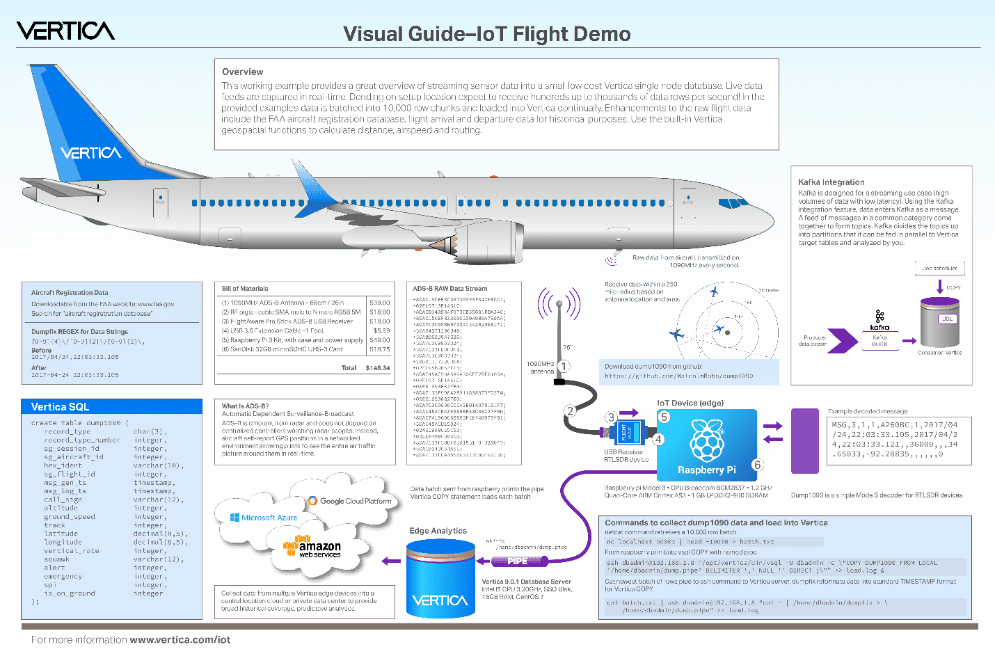
Visualize and Analyze Flight Data
Once the data is stored in Vertica, any of the popular BI Data Visualization tools can be used. In the example, we selected Tableau and built several visualizations using the flight tracking data. In the previous example, the raw data does not include aircraft type, model, or owner. We loaded this enhancement data from the public FAA Registration data to provide these columns and many more. The following example is a dashboard showing example flight tracks on a map, the number of records loading during the day, total records loaded, and a number of other details. It’s a great way to visualize this data and analyze activity. Since Tableau has options to plot latitude and longitude on a 2D plane, we looked at other packages to better visualize an actual flight path in 3D. Bringing coordinates into Google Earth, the 3D visual flight track becomes possible. We graphed points on the map along with height from recorded altitude values. We then built a plot from billions of flight data records to show aircraft manufacturer and when aircrafts were built. We also performed further analysis looking at each airline and aircraft model to assess fleet age.
 The following shows the 2D lat/long plot in Tableau from flight data coordinates. These were colored based on flight altitude.
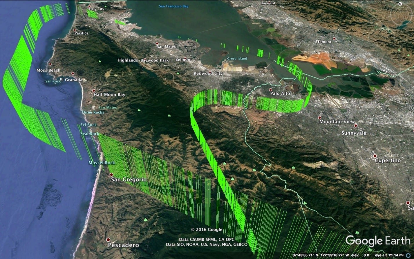
 The following shows the Google Earth 3D plot of a United Airlines flight landing at the San Francisco airport and a few hours later taking off.
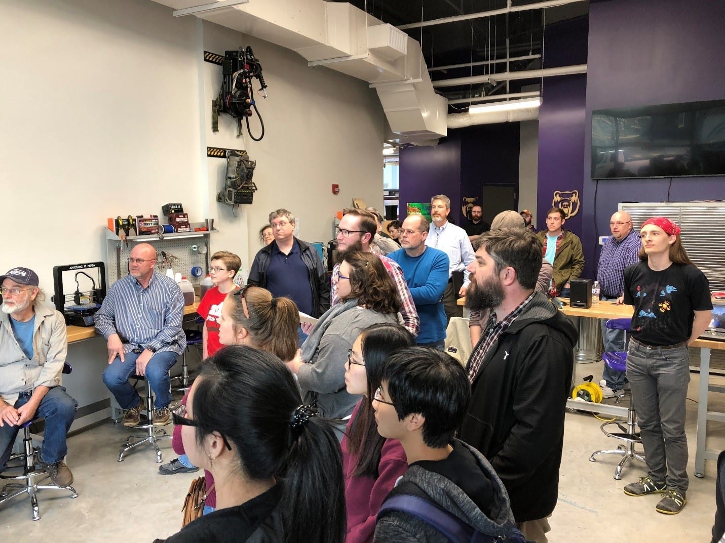
Presenting the Flight Tracking Demo
The University of Central Arkansas has approximately 12,000 graduate and undergraduate students and is one of the largest universities in the state of Arkansas. A new 3D printing lab and technology center brings students and community resources together for innovations and projects. Recently, they hosted a Raspberry pi bakeoff and the opportunity to showcase different projects built using the Raspberry pi computer. The flight tracking package is based on collection from the Raspberry pi, storage, and analysis using Vertica was well received and earned a first place award at the event.

About the Author
Tim Donar