


Introduction
As the number of features in your data set grows, it becomes harder to work with. Visualizing 2D or 3D data is straightforward, but for higher dimensions you can only select a subset of two or three features to plot at a time, or turn to more computationally expensive dimensionality reduction methods like MDS or t-SNE. Training models with a lot of features takes a long time, and the produced model might be hard to interpret due to multicollinearity. However, it’s usually true that the number of features in your data set is much higher than the actual dimensions of your data. A trivial example is that a set of points (x,y,z) in a 3D space has an actual dimensionality of 1 if the points form a straight line. In many cases a simple dimensionality reduction method like Principal Component Analysis (PCA) can be a very powerful tool. Given a set of features as the input, PCA outputs a much smaller set of features, where each of the new features is a mix of all the input features. The intuitive idea behind PCA is that we can represent our data points in a new system of coordinates so that the variance of your data is maximum along the first dimension, then becomes a little less along the second dimension, then reduces even more along the third dimension, and then quickly fades out after a small number of dimensions. If we can do that magical transformation, we can simply keep a few of the first dimensions of the transformed data and throw away the rest without losing a significant amount of information. In this blog post, we will see how PCA can be useful. For more syntax details please refer to the Vertica documentation.Data Set and Goal
In the following examples, we will use a real data set compiled from three public datasets available at https://www.gapminder.org/data/. In particular, we gather data on GDP and CO2 emission level (per capita) of 96 countries from 1970 to 2010, and also the HDI (human development index) of the same countries in 2011. The final data set has 96 rows (each country is a row) and 84 columns (country name, 41 columns for GDP, 41 columns for CO2 emission level, and one column for HDI in 2011. The raw data in text format can be downloaded here. You can use the following script to load data to Vertica.CREATE TABLE world(
country VARCHAR(30), HDI2011 FLOAT,
em1970 FLOAT, em1971 FLOAT, em1972 FLOAT, em1973 FLOAT, em1974 FLOAT, em1975 FLOAT, em1976 FLOAT, em1977 FLOAT, em1978 FLOAT, em1979 FLOAT,
em1980 FLOAT, em1981 FLOAT, em1982 FLOAT, em1983 FLOAT, em1984 FLOAT, em1985 FLOAT, em1986 FLOAT, em1987 FLOAT, em1988 FLOAT, em1989 FLOAT,
em1990 FLOAT, em1991 FLOAT, em1992 FLOAT, em1993 FLOAT, em1994 FLOAT, em1995 FLOAT, em1996 FLOAT, em1997 FLOAT, em1998 FLOAT, em1999 FLOAT,
em2000 FLOAT, em2001 FLOAT, em2002 FLOAT, em2003 FLOAT, em2004 FLOAT, em2005 FLOAT, em2006 FLOAT, em2007 FLOAT, em2008 FLOAT, em2009 FLOAT, em2010 FLOAT,
gdp1970 FLOAT, gdp1971 FLOAT, gdp1972 FLOAT, gdp1973 FLOAT, gdp1974 FLOAT, gdp1975 FLOAT, gdp1976 FLOAT, gdp1977 FLOAT, gdp1978 FLOAT, gdp1979 FLOAT,
gdp1980 FLOAT, gdp1981 FLOAT, gdp1982 FLOAT, gdp1983 FLOAT, gdp1984 FLOAT, gdp1985 FLOAT, gdp1986 FLOAT, gdp1987 FLOAT, gdp1988 FLOAT, gdp1989 FLOAT,
gdp1990 FLOAT, gdp1991 FLOAT, gdp1992 FLOAT, gdp1993 FLOAT, gdp1994 FLOAT, gdp1995 FLOAT, gdp1996 FLOAT, gdp1997 FLOAT, gdp1998 FLOAT, gdp1999 FLOAT,
gdp2000 FLOAT, gdp2001 FLOAT, gdp2002 FLOAT, gdp2003 FLOAT, gdp2004 FLOAT, gdp2005 FLOAT, gdp2006 FLOAT, gdp2007 FLOAT, gdp2008 FLOAT, gdp2009 FLOAT, gdp2010 FLOAT
);
COPY world FROM 'world.txt' WITH DELIMITER '|' SKIP 2; -- skip the header
In the next two sections, we show how to apply PCA to visualize the dataset and predict HDI using GDP and CO2 emission level.
PCA for Data Visualization
This is a sample of the data (only 5 rows, 5 columns) after loading it into a Vertica table:SELECT country, hdi2011, em1970, em2010, gdp1970, gdp2010 FROM world
ORDER BY hdi2011 desc LIMIT 5;
country | hdi2011 | em1970 | em2010 | gdp1970 | gdp2010
-----------------------+---------+-------------+-------------+-------------+-------------
Norway | 0.943 | 7.223858635 | 11.71008946 | 14893.97936 | 39970.29253
Australia | 0.929 | 11.5965694 | 16.75230078 | 12708.91935 | 25190.83986
Netherlands | 0.91 | 10.951822 | 10.95895573 | 12759.17567 | 26501.04582
United States | 0.91 | 20.66471465 | 17.50271785 | 18228.92179 | 37329.61591
Canada | 0.908 | 15.72302558 | 14.6720161 | 12986.31241 | 25575.21698
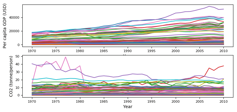
To visualize the GDP of these countries over time, we certainly can make a plot where each country is represented as a timeseries. However, it’s hard to view (see below) and what if we want to see both the GDP and emission level in one plot?
 Now, let’s see how PCA can help. We start by building a Vertica PCA model. This step will analyze the data, figure out the directions where the variance is highest (the principal components), and save that information as a Vertica object of type MODEL.
SELECT PCA('pca_model','world','*' USING PARAMETERS exclude_columns='country, HDI2011');
Note that we only consider GDP and CO2 emission as our features so we excluded country name and HDI from the model. You can see a list of all your Vertica models.
SELECT model_name, model_type, create_time FROM models;
model_name | model_type | create_time
-----------+------------+-------------------------------
pca_model  | PCA        | 2018-04-26 10:51:12.944904-04
(1 row)
Let’s look into the model we have just built to see how much we can reduce in terms of dimensions. First, we see what attributes are available:
SELECT get_model_attribute(USING PARAMETERS model_name='pca_model');
attr_name             | attr_fields                                                      | #_of_rows
----------------------+------------------------------------------------------------------+-----------
columns              | index, name, mean, sd                                            | 82
singular_values      | index, value, explained_variance, accumulated_explained_variance | 82
principal_components | index, PC1, PC2, PC3, PC4, PC5, PC6, PC7, PC8,...                | 82
counters             | counter_name, counter_value                                      | 3
call_string          | call_string                                                      | 1
(5 rows)
Then, we look into an important attribute table named singular_values. We especially pay attention to its last column.
SELECT get_model_attribute(USING PARAMETERS model_name='pca_model', attr_name='singular_values') LIMIT 5;
index | value            | explained_variance   | accumulated_explained_variance
------+------------------+----------------------+--------------------------------
1    | 57302.0891112066 | 0.984897289327798    | 0.984897289327798
2    | 6123.66739335371 | 0.0112479458977945   | 0.996145235225592
3    | 2373.31959725626 | 0.0016895166710919   | 0.997834751896684
4    | 1561.0057291494  | 0.000730901788784191 | 0.998565653685468
5    | 1337.35331582116 | 0.000536466180155844 | 0.999102119865624
(5 rows)
The last column tells us that if we reduce to two dimensions, we can still keep 99.6% of the variance in our data. If we do that, we’ll be able to represent each country as one point on a 2D plot. Just another call to apply the model to transform the data.
CREATE TABLE transformed_data_2comp AS SELECT apply_pca(* USING PARAMETERS model_name='pca_model',
exclude_columns='country, HDI2011', key_columns='country, HDI2011', num_components=2) OVER(PARTITION BEST) FROM world;
Here is a sample of the transformed data:
SELECT * FROM transformed_data_2comp ORDER BY HDI2011 desc LIMIT 5;
country        | HDI2011 |       col1       |       col2
-----------------------+---------+------------------+-------------------
Norway               |   0.943 | 150650.121818738 | -5172.01091070906
Australia            |   0.929 | 75525.0865191995 |  2918.93252935131
Netherlands          |    0.91 | 84832.5445950833 |  2863.39737848701
United States        |    0.91 | 143449.445116492 |  5459.03959714618
Canada               |   0.908 | 85446.2166693354 |  7027.35172201217
Now let’s plot those two columns:
 The color of each point represents the country’s HDI in 2011, where a darker color indicates a higher HDI, as shown on the vertical bar on the right hand side. It’s interesting to see the exceptional case of Luxembourg, which is at the lower right corner of the plot. This country has the emission level drops significantly, while GDP increased 3 times in the 40-year period. (In the timeseries plot we have seen before it was the purple line at the top.)
PCA for Model Creation
The transformed data can also be fed into other Vertica algorithms to build other predictive models. In this section, we show that for Random Forest Regressor, a model trained on PCA-transformed data has almost the same prediction capability compared to model trained on the original data. First, we randomly split the data into a training set and a testing set at a ratio of 80:20. The two sets are stored as Vertica tables: train_data (73 countries) and test_data (23 countries), respectively.ALTER TABLE world ADD COLUMN isTrain BOOL;
UPDATE world SET isTrain = (random() < 0.8);
CREATE VIEW train_data AS SELECT * FROM world WHERE isTrain=True;
CREATE VIEW test_data AS SELECT * FROM world WHERE isTrain=False;
Second, we build the first Random Forest Regressor model using all 82 columns of the train_data table.
SELECT rf_regressor('rf1','train_data','HDI2011','*' USING PARAMETERS exclude_columns='country, HDI2011, isTrain', ntree=500);
Then we evaluate it on the test_data table.
CREATE TABLE eval_rf1_on_test_data AS
SELECT country, HDI2011 AS true_HDI, predict_rf_regressor(
em1970, em1971, em1972, em1973, em1974, em1975, em1976, em1977, em1978, em1979,
em1980, em1981, em1982, em1983, em1984, em1985, em1986, em1987, em1988, em1989,
em1990, em1991, em1992, em1993, em1994, em1995, em1996, em1997, em1998, em1999,
em2000, em2001, em2002, em2003, em2004, em2005, em2006, em2007, em2008, em2009, em2010,
gdp1970, gdp1971, gdp1972, gdp1973, gdp1974, gdp1975, gdp1976, gdp1977, gdp1978, gdp1979,
gdp1980, gdp1981, gdp1982, gdp1983, gdp1984, gdp1985, gdp1986, gdp1987, gdp1988, gdp1989,
gdp1990, gdp1991, gdp1992, gdp1993, gdp1994, gdp1995, gdp1996, gdp1997, gdp1998, gdp1999,
gdp2000, gdp2001, gdp2002, gdp2003, gdp2004, gdp2005, gdp2006, gdp2007, gdp2008, gdp2009, gdp2010
USING PARAMETERS model_name='rf1') AS predicted_HDI_all_features
FROM test_data;
Third, we build a PCA model from our train_data table, and use it to transform the train_data table into transformed_train_data but keep 5 columns (99.9 variance in the data). Then we build the second Random Forest Regressor model using that new table transformed_train_data.
SELECT PCA('pca_model_on_train_data','train_data','*' USING PARAMETERS exclude_columns='country, HDI2011, isTrain');
CREATE TABLE transformed_train_data AS
SELECT apply_pca(* USING PARAMETERS model_name='pca_model_on_train_data',
exclude_columns='country, HDI2011, isTrain', key_columns='country, HDI2011', num_components=5) OVER(PARTITION BEST) FROM train_data;
SELECT rf_regressor('rf2','transformed_train_data','HDI2011','*' USING PARAMETERS exclude_columns='country, HDI2011', ntree=500);
Next, we use the same PCA model to transform the test_data table into transformed_test_data table, and then use it to evaluate our second Random Forest Regressor model.
CREATE TABLE eval_rf2_on_test_data AS
SELECT country, HDI2011 AS true_HDI, predict_rf_regressor(col1, col2, col3, col4, col5
USING PARAMETERS model_name='rf2') AS predicted_HDI_5components
FROM transformed_test_data;
Finally, we combine the two tables eval_rf1_on_test_data and eval_rf2_on_test_data, so we can compare the two models.
SELECT a.country, a.true_HDI, a.predicted_HDI_all_features, b.predicted_HDI_5components FROM eval_rf1_on_test_data a, eval_rf2_on_test_data b WHERE a.country=b.country ORDER BY a.true_HDI;
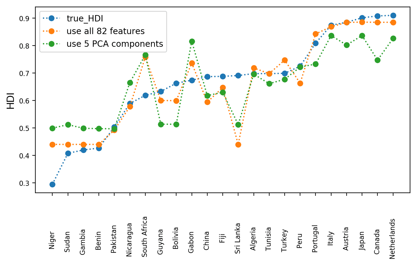
Now we can make a plot to compare the two models. The dotted lines are added for easy viewing. We see that the orange line, which is the performance of the rf1 model trained on 82 columns is still quite similar to the green line, which is the performance of the rf2 model trained on 5 PCA-transformed columns Note that we don’t claim that HDI can be accurately predicted by GDP and CO2 emission, but instead we show that by using PCA we can greatly reduce the amount of training data without losing much of the predictive power.
Conclusion
We have seen that PCA can be very helpful when working with high-dimensional data. It transforms the datapoints into a new coordinate system where variance in the data concentrates in fewer dimensions, which allows us to approximate the datapoints using only those few dimensions. PCA works under the assumption that data variance is important so it drops the dimensions where variance is little. From a database perspective, we can think that PCA transforms a wide table with many columns to a narrow table with a fewer columns. Note that each new column is actually a linear combination of all the original columns. After reducing dimensions of our data, visualization, and model training becomes easier and faster. Give it a try to see if it works for your case.About the Author
Soniya Shah
Information Developer
Currently, a first year law student with a background in science and technology. Experienced technical writer, with specializations in software documentation, big data, blog development, and website development. I build user-centered content to communicate complex and technical information more easily.
I used to work for Vertica full time for about 3 years. I still work at Vertica part time while going to law school.
Update: Soniya is now doing her law internship, and no longer working at Vertica. Good luck, Soniya!