


In the first machine learning in a database post, we discussed some of the reasons why it makes sense to do your machine learning data analytics inside the database. This will be the first post where we discuss some of the steps involved in the in-database machine learning workflow. Generally, the first thing you need to do is explore your data. This can involve many things, but discovering which features correlate with each other is one key aspect.
Vertica has a function, named CORR_MATRIX (as of Vertica 9.2SP1) for calculating a correlation matrix. It takes an input relation with numerical columns, and calculates Pearson Correlation Coefficient between each pair of its input columns. This function is implemented as a Multi-Phase Transform function, and employs the powerful Vertica distributed execution engine to run at scale. In this blog post, we will first review the concept of a correlation matrix briefly. Then, we introduce our new function, and show you how to use it with the help of an example.
What is a Correlation Matrix?
Statisticians and data analysts measure the correlation of two numerical variables to find insight about their relationships. On a dataset with many attributes, the set of correlation values between pairs of its attributes form a matrix which is called a correlation matrix.
There are several methods for calculating a correlation value. The most popular one is Pearson Correlation Coefficient. Nevertheless, it should be noticed that it measures only linear relationship between two variables. In other words, it may not be able to reveal a nonlinear relationship. The value of Pearson correlation ranges from -1 to +1, where +/-1 describes a perfect positive/negative correlation and 0 means no correlation.
The correlation matrix is a symmetrical matrix with all diagonal elements equal to +1. We would like to emphasise that a correlation matrix only provides insight to a data scientist about correlation, and it is NOT a reliable tool to study causation. Indeed, the correlation values should be carefully interpreted by an expert to avoid nonsense statements. For example, it has been shown that there is a strong positive correlation between US spending on science and the number of hanging suicides from 1999 to 2009 (check here for several other spurious correlations: https://www.tylervigen.com/spurious-correlations).
Let’s look at a few examples of correlation matrixes in different domains.
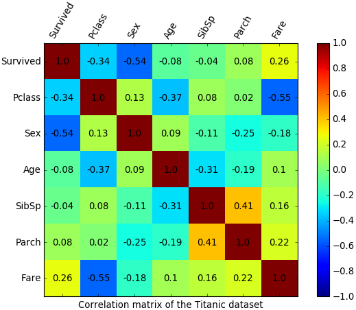
Example 1 – Titanic dataset
The Titanic dataset contains records of the passengers on the famous ship, RMS Titanic. Each record captures some information about a passenger like ticket class, age, sex, etc. There is also a Boolean field determining if that particular passenger survived the historical accident. Let’s take a look at a correlation matrix with a few relevant features. We used the following variables.
| Variable name | Definition | Note |
| Survived | Indicates survival | 0 = No, 1 = Yes |
| Pclass | Ticket (passanger) class | 1 = 1st, 2 = 2nd, 3 = 3rd |
| Sex | Gender | 0 = Female, 1 = Male |
| Age | Age in years | |
| SibSp | # of siblings / spouses aboard the Titanic | |
| Parch | # of parents / children aboard the Titanic | |
| Fare | Passenger fare |
The following figure shows the correlation matrix on a heatmap. We can derive the following insights from this correlation matrix.
- There is a high negative correlation between survival and sex.
- Survival is not linearly correlated to age, SibSp, or Parch (lack of linear correlation doesn’t cross out the hypothesis of nonlinear correlation).
- Ticket class is highly correlated with the fare (A first class ticket is more expensive than a third one).
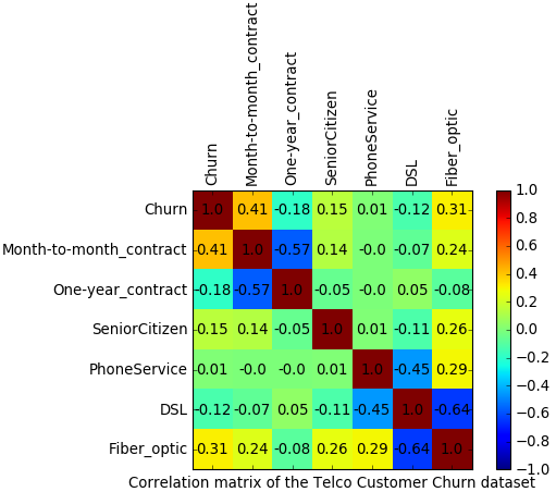
Example 2 – Telco customer churn
The Telco Customer Churn dataset represents data collected for studying customer retention in a telecommunication company. Each row corresponds to a customer, and each column is an attribute describing that customer. We extracted the following attributes for calculating the correlation matrix.
| Variable name | Definition | Note |
| Churn | Was the customer churned? | 0 = No, 1 = Yes |
| Month-to-Month_contract | Was it a monthly contract? | 0 = No, 1 = Yes |
| Ony-year_contract | Was it a one-year contract? | 0 = No, 1 = Yes |
| SeniorCitizen | Was the customer is a senior citizen? | 0 = No, 1 = Yes |
| PhoneService | Did the customer have a phone service? | 0 = No, 1 = Yes |
| DSL | Did the customer have a DSL internet connection? | 0 = No, 1 = Yes |
| Fiber_optic | Did the customer have a Fiber optic internet connection? | 0 = No, 1 = Yes |
The following figure shows the correlation matrix. We can derive the following insights from it.
- Churn is correlated with a month-to-month contract (the user has the flexibility to change the operator any month).
- Churn is linearly correlated neither to being a senior customer nor to having a phone service.
- The Fiber-optic option seems correlated to churn (perhaps, the Fiber-optic option is not really a good one).
- DSL option has a high negative correlation with the Fiber-optic option (it seems that people who subscribed to Fiber-optic don’t have the DSL).
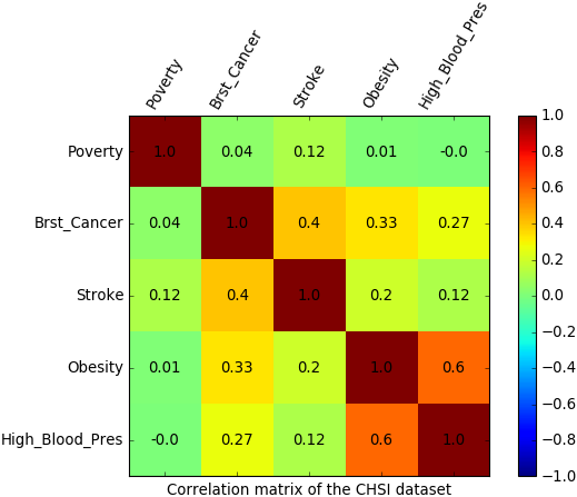
Example 3 – Health status indicators
The CHSI dataset contains over 200 health status indicators for all United States counties since 2015. We extracted the following attributes from this dataset for calculating a correlation matrix.
| Variable name | Definition | Note |
| Poverty | Individuals living below poverty level | Percentage in the county |
| Brst_Cancer | Female death because of breast cancer | Percentage in the county |
| Stroke | Death because of stroke | Percentage in the county |
| Obesity | Individuals with obesity | Percentage in the county |
| High_Blood_Pres | Individuals with high blood pressure | Percentage in the county |
We can derive the following insights from the correlation matrix which is illustrated below.
- There is a strong positive correlation between Obesity and High-blood-pressure.
- A moderate positive correlation can be observed between Breast-cancer and Stroke.
- No significant linear correlation can be observed between Poverty and any of these noninfectious diseases.
Hands-on example
Now, let’s walk through a hands-on example of using the CORR_MATRIX function. To make it easy for you to rerun the example, we use a small dataset, named Auto-MPG. The dataset contains the technical spec of several cars.

You can use the following commands to load the data to Vertica:
-- setting the absolute path of the CSV file

\set file_path '\'/home/my_folder/auto-mpg.csv\''

-- creating the table

CREATE TABLE auto_mpg (mpg FLOAT, cylinders INT, displacement FLOAT, horsepower FLOAT, weight FLOAT, acceleration FLOAT, model_year INT, origin INT, car_name VARCHAR);

-- loading the dataset from the file to the table

COPY auto_mpg FROM LOCAL :file_path WITH DELIMITER ',' NULL AS '?';
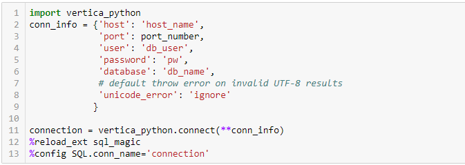
In this example, we use a Python Jupyter Notebook to connect to our Vertica database because it has nice libraries to plot the heatmap of a correlation matrix. It should be noticed that the input data may have billions of rows, but the size of its correlation matrix is a function of the number of its attributes; therefore, it would be small. The correlation matrix is calculated inside Vertica in a distributed fashion. Then, the resulted matrix will be loaded to Python for plotting purpose.
We use the open source vertica-python adapter to connect to Vertica from Python Notebook. As you can find from its GitHub page, it is very easy to install and use this adapter. The following commands are what we ran to connect to our Vertica server. You need to replace host_name, port_number, db_user, pw, and db_name to your own customized values.
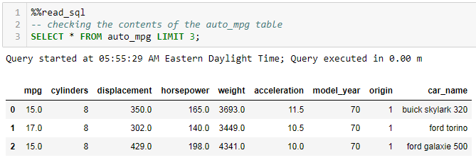
Assuming the auto_mpg table is already created and loaded, you can peek at its content using the following command.
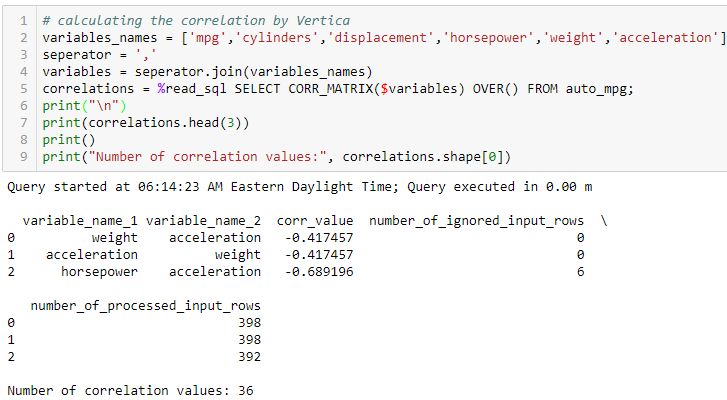
Let’s call the CORR_MATRIX function to calculate correlation matrix of the relevant columns of this table and store its result in a Python variable named correlations. The function returns the matrix in a triple format. That is, each pair-wise correlation is identified by 3 returned columns: variable_name_1, variable_name_2, and corr_value. The result also contains two extra columns named “number_of_ignored_input_rows” and “number_of_processed_input_rows”. The value of these columns indicate the number of rows from the input which are ignored/used to calculate the corresponding correlation value. Any input pair with NULL, Inf, or NaN will be ignored. Looking at the first 3 rows of the result, we can find that all the rows (398 rows) are used for calculating correlation value between weight and acceleration. In comparison, 6 rows are ignored in calculation of correlation value between horsepower and acceleration. We can also check that there are 36 rows in the result as we expected, because having 6 variables, the matrix should have 6*6 elements.
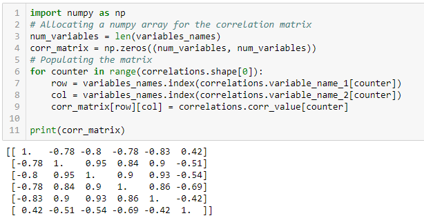
To plot the heatmap of the correlation matrix, we first make a two-dimensional NumPy array of the result.
Now, we can plot the heatmap using the matplotlib library.
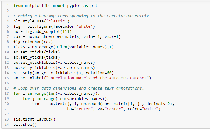
Here is the result.
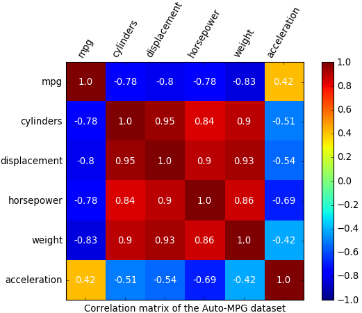
Looking at the correlation matrix, it seems that mpg has a strong negative correlation with #cylinders, displacement, horsepower, and weight. In comparison, it has a weak positive correlation with acceleration.
Summary
The CORR_MATRIX function provides an easy way to calculate the correlation matrix of data stored in Vertica. It supports any Vertica numeric type and BOOL (which will be internally converted to FLOAT). It also automatically filters any invalid data like NULL, NAN, or INF from its calculations.
You can use this scalable and convenient function in Vertica to calculate the correlation matrix, and then move the matrix to Python in order to make beautiful presentations.
Why Not Use Pandas?
We have done a simple experiment to compare the required time for calculating a correlation matrix in Vertica with Python-Pandas. We used a 4-node Vertica cluster with the following spec for each node:
- CPU: 36 – 1.2GHz physical cores (Genuine Intel)
- Memory: 755GB RAM
- Network: 10Gbps Ethernet
- Database: Vertica 9.2.1-2
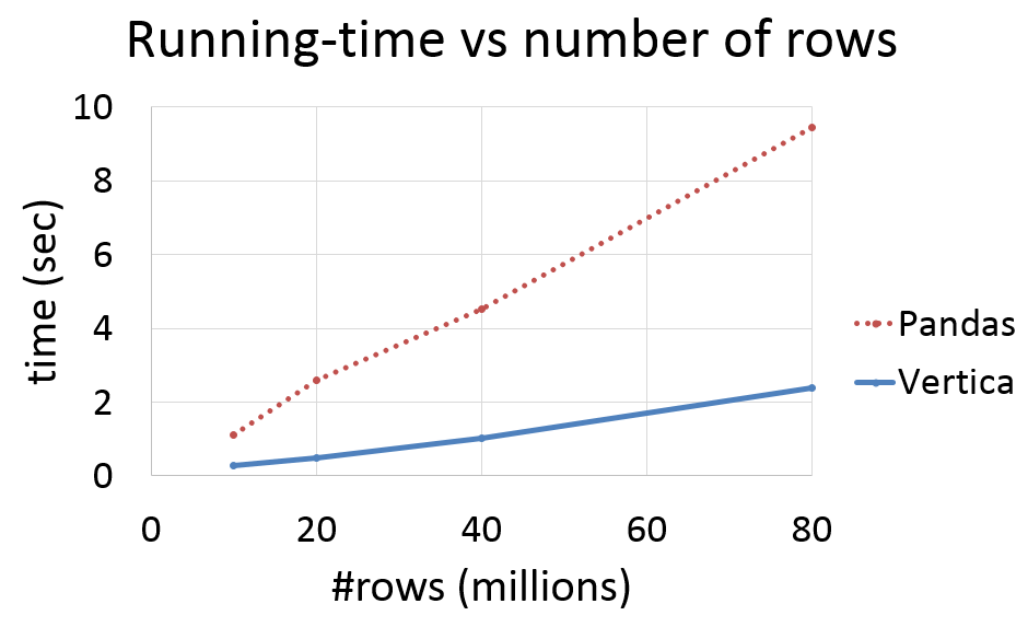
The following chart illustrates the running time for calculating a correlation matrix using Vertica and using Python-Pandas. The original data were stored in 4 different tables with 4 columns in Vertica. Tables have 10M, 20M, 40M, and 80M rows. The Python interpreter was running on one of the cluster nodes. The running time of Pandas excludes the time for loading data from Vertica to Pandas dataframes. We can observe that the running time in both cases increases linearly with the number of rows, but it has a larger slope for Pandas. The more data you need to use to calculate the correlation matrix, the more efficient using Vertica will be.
Next chart displays the loading time of Pandas dataframes from the same Vertica tables. As you observe, the loading time is about two orders of magnitude longer than the calculation time.
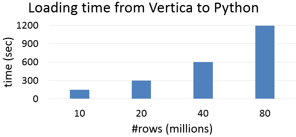
As you can see, moving your data into a dataframe is costly, in itself. It is almost always more efficient to analyze data directly in the database.
It is worth mentioning that there has been another function in Vertica, named CORR, for calculating Pearson correlation coefficient of two columns. Although a correlation matrix can also be calculated by many calls of that old function, for a large number of columns, it would be cumbersome and not very efficient. For example, the CORR function would need to be called 4095 times to calculate a correlation matrix of a table with 91 columns and 464K rows. It took 132.8 seconds on our previously described cluster to run this many calls of the CORR function. In comparison, a single call of the newly added CORR_MATRIX function does the same job in 4.2 seconds.
We hope that the new CORR_MATRIX function and our other analytical tools help you to extract more value out of your data. Please go to our online documentation to learn more about Vertica tools for Big Data Analytics.
Related posts and resources:
1: Why Would You Do Machine Learning In a Database?
Make Data Analysis Easier with Dimensionality Reduction
Evaluating Classifier Models in Vertica
Vertica’s In-Database Random Forest
Open Source Vertica-Python Client
IOT Smart Metering
VerticaPy Jupyter Notebook Library
How to Code Vertica UDx
Content Analytics and Video Recommendation Systems with Vertica
and
Machine Learning page on Vertica.com
About the Author
Arash Fard
Senior Software Engineer at Vertica